Humanitarian aggrevation
by Vinay Gupta • May 29, 2008 • The Global Picture • 0 Comments
I’ve spent the last couple of days trying to find a good way to compare various humanitarian sheltering technologies to one another. Here’s the bad news: there’s no effective work in the field as far as I can find.
What I mean by this is quite simple: how do we approach the question of “is this shelter right for this crisis?”
There are three basic factors here:
1> The climate and local conditions, most of which can be dragged pretty quickly out of one database or another. Global climate is well measured.
2> The shelter itself. Here’s the rub. There’s like one paper on thermal modeling of emergency tents that I can find, and maybe one more on cardboard shelters. Maybe I’m just missing a sea of research, but I don’t think so.
How much insulation is enough for any given degree of cold or nasty? How much of a foundation / floor system do you need for various rainfall patterns?
These things are objective research questions. But we’ve got, year by year, millions and millions of people who’re being sheltered in emergencies, and (as far as I can find) no coherent modeling of what’s actually going on at a fundamental level in the basic shelter technologies.
This just doesn’t seem right. This seems like something the military may have worked out in a fair bit of detail, but I’ve yet to make the connection to find the right report in the oceans of .gov and .mil data.
3> The people. How cold is too cold? What’s a minimum sleeping temperature without serious gear? 55F? 40F? 32F? What about for children or babies? What about thermal loading in the day time?
There should be a basic model: this is what people need to survive, and as you go further from that basic core definition of safe, you get bands of increasing mortality. Suppose you want to support a population to the point where there will be only 1 excess death per 1000 people, and they’re in Climate X, what gear do you need to ship them?
This, to me, is the fundamental modeling issue that needs to be addressed: shelter, food, water purification etc. need to be expressed in a standard metric, and I think it’s easiest, fairest and most accurate to work first on excess mortality, and secondly on perceived quality of life.
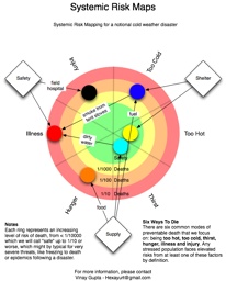
The following diagram is one suggested approach: the “LifeWheel” – which shows escalating risk towards the edges of the diagram, in the red area, and provides some space to map interdependencies and interactions in the center. Each ring represents a factor 10 increase in mortality from that cause of death, from < 1 in 10,000, which we will call “safety”, through 1 in 1000, 1 in 100, and 1 in 10 which represent escalating risks. 1 in 10 is not unrealistic for things like epidemics following an earthquake, or freezing to death in cold weather disasters.
The “six ways to die” model is then mapped on top of the six ways to die model, which suggests there are six common causes of death:
* too hot
* too cold
* thirst
* hunger
* illness
* injury
The goal of any relief effort is to make sure that people stay alive (initially) and than self-sufficiency is restored (eventually.)
I’m hoping that as we continue to develop these concepts and tools, we will come up with a new way to think through disaster relief and poverty issues, in a way which makes it clear where the research needs to be conducted and where the money needs to be spent to have the greatest positive impact on the worst problems.
Click the diagram for a bigger version which reflects a simple model of a typical cold weather disaster.

