
Global Systems Mapping
by Vinay Gupta • June 20, 2008 • The Global Picture • 1 Comment
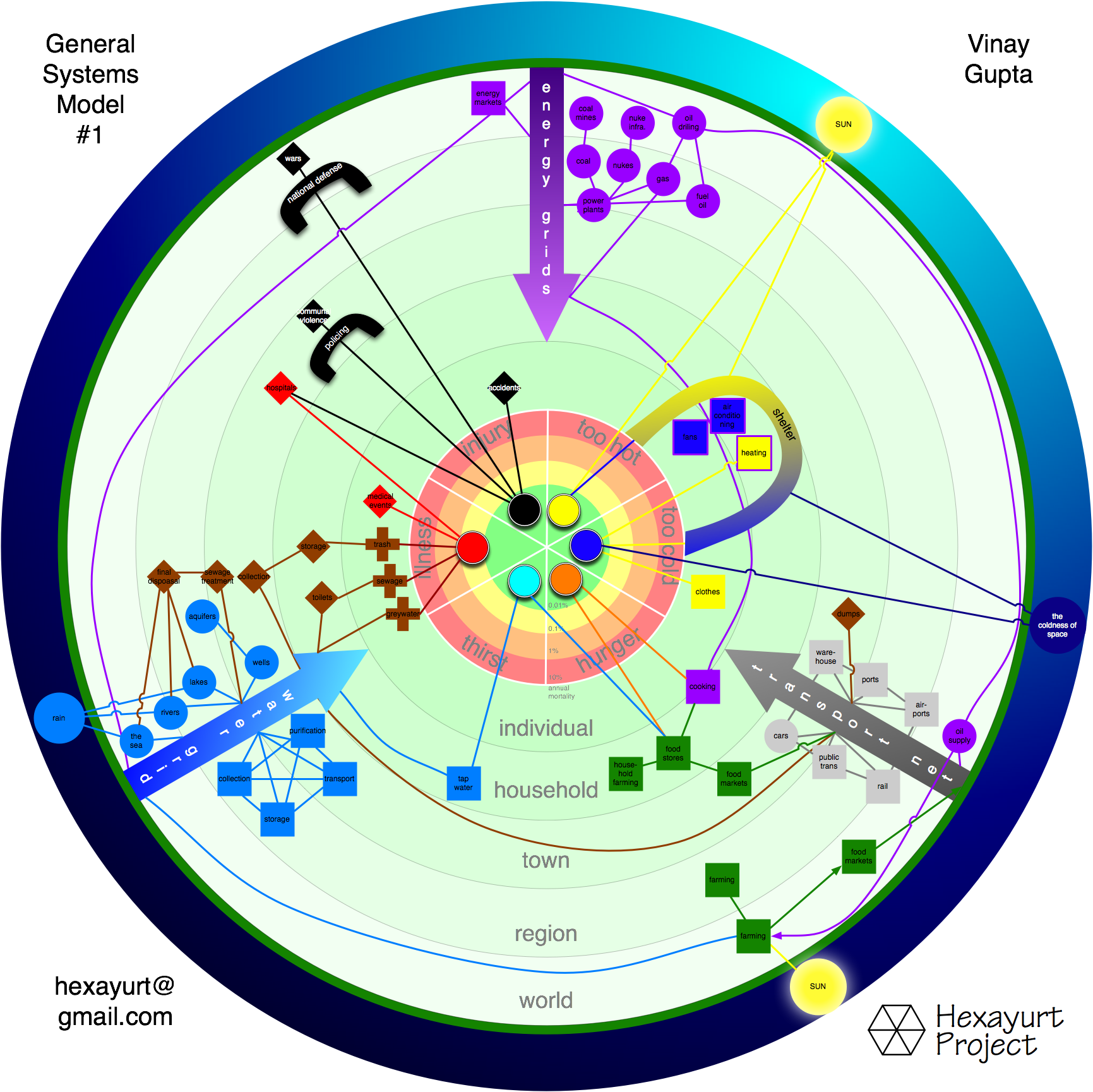
Shows roughly how the infrastructure works in a modern society. It’s the “general case” – to really get the detail down requires configuring the diagram for a specific place and time, but I think the rapid overview picture is still extremely useful.
A work in progress.
Five things on the chart.
1> Six Ways To Die (the target in the center.) Each ring is 10x the mortality rate, from 1/10000 to 1/10
2> Status dot showing current mortality for the population at hand.
3> Various things which impact the mortality – things like the water supply, the power grid, the food transportation grid, farms, and so on.
4> Range of those things from the individual level – individual, household, town, regional, national. Helps show what can break if networks are disrupted.
5> Simplified infrastructure interdependencies.
Observations: it’s astonishingly complicated, much more so that I’d thought it would be, and this is just a rough draft.
It’ll also show, very nicely, why the hexayurt infrastructure system is a very good idea, because that version of the graph has *almost no dependencies* on the various grids. And this makes it very, very clear.
Vinay
![]()
Very nice! Reminds me a bit of Ken Wilber’s AQAL Matrix, though his is tracking value memes.
http://www.flickr.com/photos/slark/44612365/
I am very impressed by your hexayurt work.
Asoka